OneUX
Designing the design system for Philips
My Role
OneUX was a big initiative by Philips to unify the user experience across all Philips consumer electronics products. As the portfolio of products grew, the user experience across these products got more and more disconnected. I was part of the team that worked on solving this problem and defined the OneUX principles for Philips Consumer electronics products.
Research
This project required a lot of research to understand different product platforms, their limitations and incorporate all these constraints in the new identity design.
Leadership
I managed a distributed design team and also provided creative direction to the team.
The Need
The Philips range of consumer electronics products was getting very diverse as the product portfolios grew. From low-end CRT TV's for developing countries to high-end LCD smart TV's, from small dot matric display media players to high-end touchscreen media players, from simple DVD players to high-end blue way home theatre systems.
As these portfolios grew, the user experience across these products was compromised due to many factors including disconnected teams working in different countries. But most importantly, the lack of a well-defined design system.
So our team was tasked to bring order to this chaos. Below is a glimpse of how we designed this system.
Brand Pillars
Designed Around You

Easy to Experience

Advanced
Based on the brand pillars, we came up with a DNA Pyramid. The Pyramid laid the foundation for the design system. It provided a clear path for anyone to apply the brand identity and scale it all the way from a range (eg. Home Entertainment) to a product (eg. Television) to a specific segment within the product (eg. High-End TV for Europe).
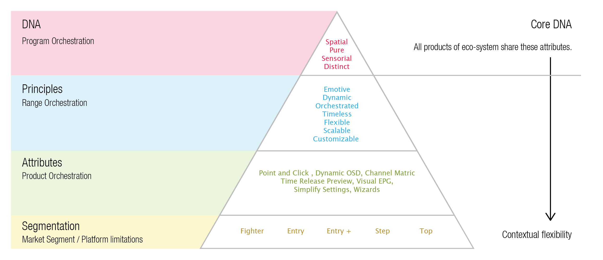
Identity DNA
Spatial
Dimensional and temporal depth and space without boundaries.
- Seamless effect blending from screen to product
- Intuitive spatial navigation based on content selection
- Transitional animation based on content constancy
- Simple uncluttered visual style (Less is more)
Pure
Honest, light, geometric and uncluttered, a timeless aesthetic.
- Simple visual style creating focus on content
- Intuitive point of focus (highlight)
- Spatial open minimal quality
- Acts as a backdrop for content with no unnecessary detail or decoration
Sensorial
Dynamic, visual, audible and tactile appeal.
- Dynamic through content playback or preview and transition
- Light (and movement) used to guide and indicate direction
- Illumination to intensify experience (magical) and focus
- Content and transparency add texture and color
- Sound to support interaction
Distinctive
An identity that is recognizable for its quality and innovation.
- Modern, Sophisticated, Memorable
- Smooth and flowing
- Ambient and Dynamic
- Bold but not aggressive
Identity Principles
OneUX identity is based on very simple rules. It makes common use of a few signature elements to create a ‘family’ that is more resistant to time. These principles help range orchestration.

Emotive
Our goal is to generate positive emotional responses. The user should always feel "Delighted". To achieve this, we need to follow certain rules.
- The user should never be more than one click away from play state.
- The user should not be trying to figure out where to look for content.
- Content should be visible in preview (thumbnail, cover art, video) as much as possible.
- Content is Color. Underlying identity should be really simple. The colors in the user interface should come from the content itself.
- Content should not lose focus at any time during state transitions e.g. the channel in a TV stays selected channel in the channel list.

Dynamic
The ambition of every One UX manifestation should be to achieve - Smooth (if possible 'Dynamic') progression through the interaction experience.
- Dynamic transitions, animations, and content preview are the basic elements of the "cinema-graphic" experience.
- Use transparency to make it feel alive and cinematic.
- Dynamic ambient wallpaper or video in the background should provide visual interest, color, and movement.
- Content Preview should also be generated dynamically to delight the users (eg. Channel preview before switching channel).

Orchestrated
User Experience of the product is intended to be more directly related and integrated into the product proposition.
- The visual style is intrinsically part of the product proposition.
- The interface blends seamlessly into the product experience.
- Ambient Light is used to extend and underpin the Sensorial experience.
- Consistent use of a glowing highlight should be used as a red-thread design signature.

Timeless
The objective of OneUX is to strive to achieve a design that is more resistant to time. To achieve the timeless design, use the following signatures.
- Minimalist design with few screen elements is less subject to age.
- Screens and Dialogues should only contain elements that are relevant to the context.
- Every extra element in the screen competes with the point of focus and diminishes its relative visibility.
- Any decoration should have a clear link to functional purpose and experience based on the product proposition.

Flexible
Differing development and product lifecycles highlight the need for more flexibility. The key purpose of OneUX is to also provide the required flexibility to adapt to different applications, interaction paradigms, and platforms limitations.
- The identity elements should be apparent in the design of all products.
- The product context dictates the way in which the identity is specifically applied.
- The resulting design must ‘fit’ into the family of products it is a part of and into the common view of the identity as a whole.
- Spatial Mapping (layout), scale, and even the approach to visual elements (such as icons) may be affected by context, but should still be consistent with the visual identity.
Scalable
Differing platform capabilities require different approaches. OneUX defines the principle of ‘graceful degradation’ that ensures quality, allowing for and encouraging intelligent variation.
- Graceful degradation requires that each platform and its conditions need to be carefully analyzed to define a dedicated design solution.
- Scaling is facilitated by the simplicity of the visual identity elements.
- Content should always be the main focus of the user experience (e.g. use of transparency on video).
- A value judgment of how well a proposed solution adheres to the identity should be made before the product is launched.

Customizable
Personalization by the user is an option that helps create differentiation. While customization is allowed, these rules should be followed.
- Provide the OneUX identity as the default ‘out of the box’ experience.
- Customization (if offered) should primarily be in the form of complete skins that are selectable by the user.
- Choice of icon style available to the user is permitted as long as the icons are designed using the icon guidelines.
Color
Understanding the concept of Color is the most significant aspect of OneUX. The color scheme creates a sophisticated UI which blends into and compliments the product design. Color use is limited to create a clean and timeless look.
The UI is a backdrop for content preview. It is the content itself rather than the UI that brings color. Color, Glow, and Transparency are also used to create functional hierarchy and to support navigation. Color and contrast are used to create ‘focus’ in the glow around the highlight.
Palette
The color palette is limited to a set of blues, greys, and black. The rest of the color comes from the content itself.
Pure white should be avoided as it creates a very bright light on LCD screens. Use screen white instead.
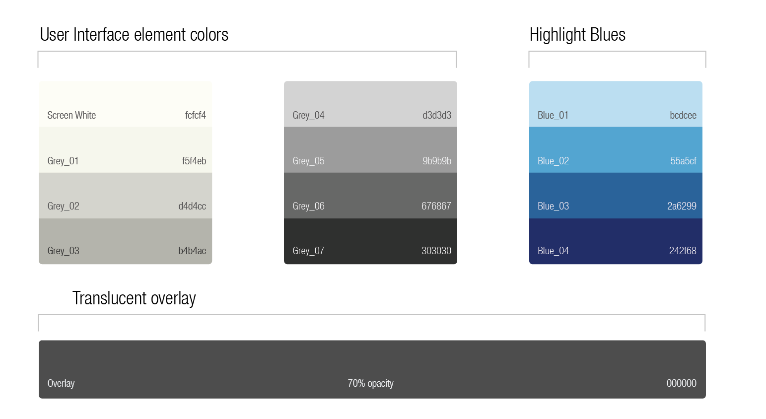
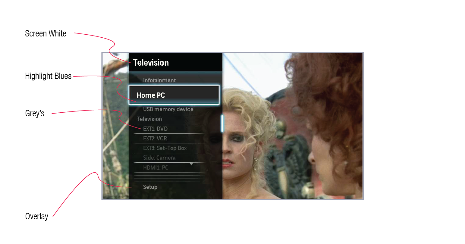
Pallette in use
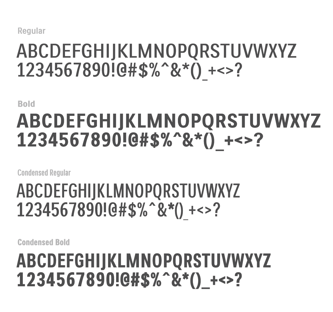
Fonts
Use Philips Screen fonts for all user interface designs. Depending on the hardware capabilities, use either TTF or Pixel Fonts.
The Philips Screen Font is used with size and weight dependant on the context of the design. Font weight and size are used to create visual hierarchy. Text color makes use of maximum color contrast to deal with different background conditions.
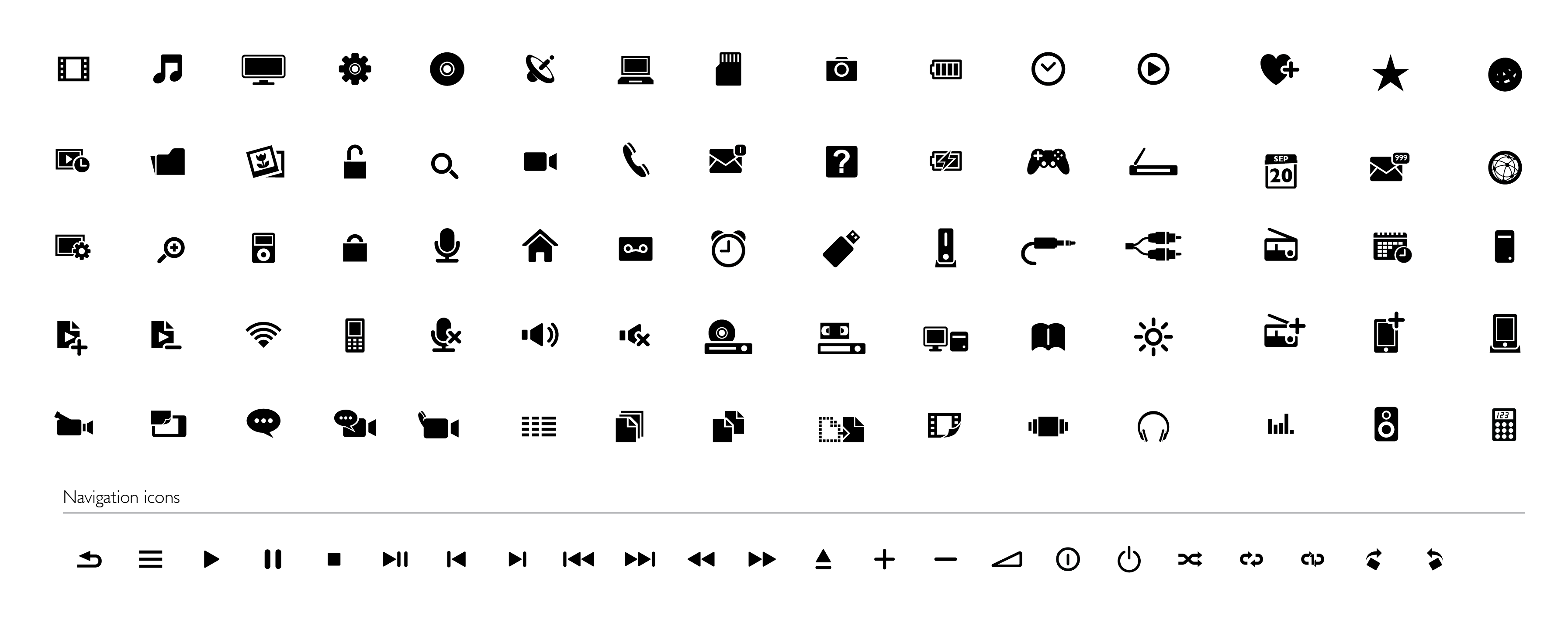
Icons
Icon style in OneUX makes consistent use of metaphor but is stylistically dependant on the product context. Time release is applied to icons, where the icon and its label swap focus and then lead to an enriched info or content preview. A ‘light’ glow (selected state) effect is used to create qualitative illumination. The states of the icon are created with color and the glow effect.
To unify the use of metaphors across Philips products, a set of icon library is available for common use. In case a new icon needs to be designed, it should follow the Icon grid and the rules specified.
Basic Icon Set
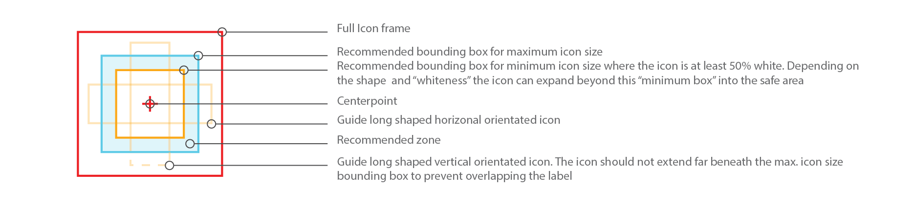
Icon Grid and Rules
Icon Usage
Wordmark
- Clear brand ‘moments’ should be defined in each product area, the wordmark can then be applied in a sympathetic way related to the context.
- The ‘outline’ (shape) of the wordmark should not be altered, whatever dynamic context it is used in.
- In general, the wordmark should be screen white on black, black on screen white, or blue (R11 | G94 | B215) on screen white.
- Show at startup/ splash …. in a prominent position.
- Position and size dependent per product resolution and screen orientation.
Wordmark Usage example (Mobile Screen)
Diamond Navigation
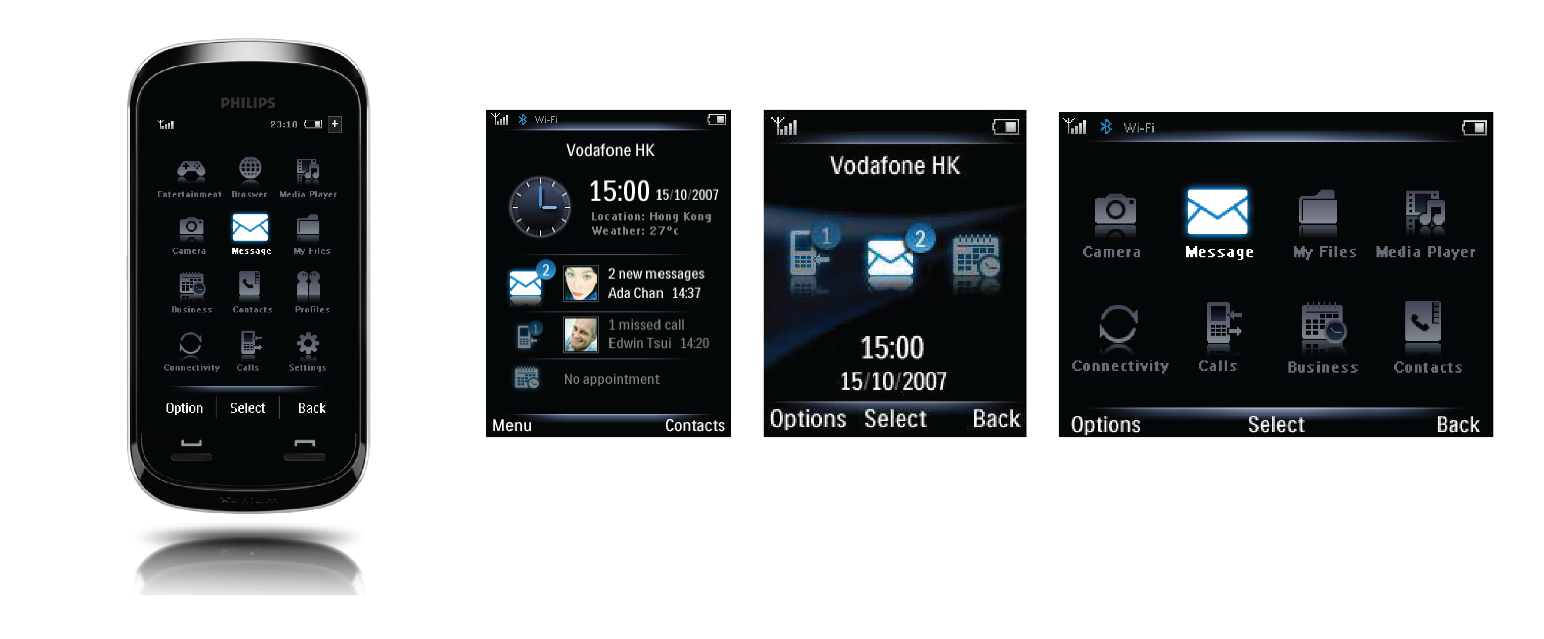
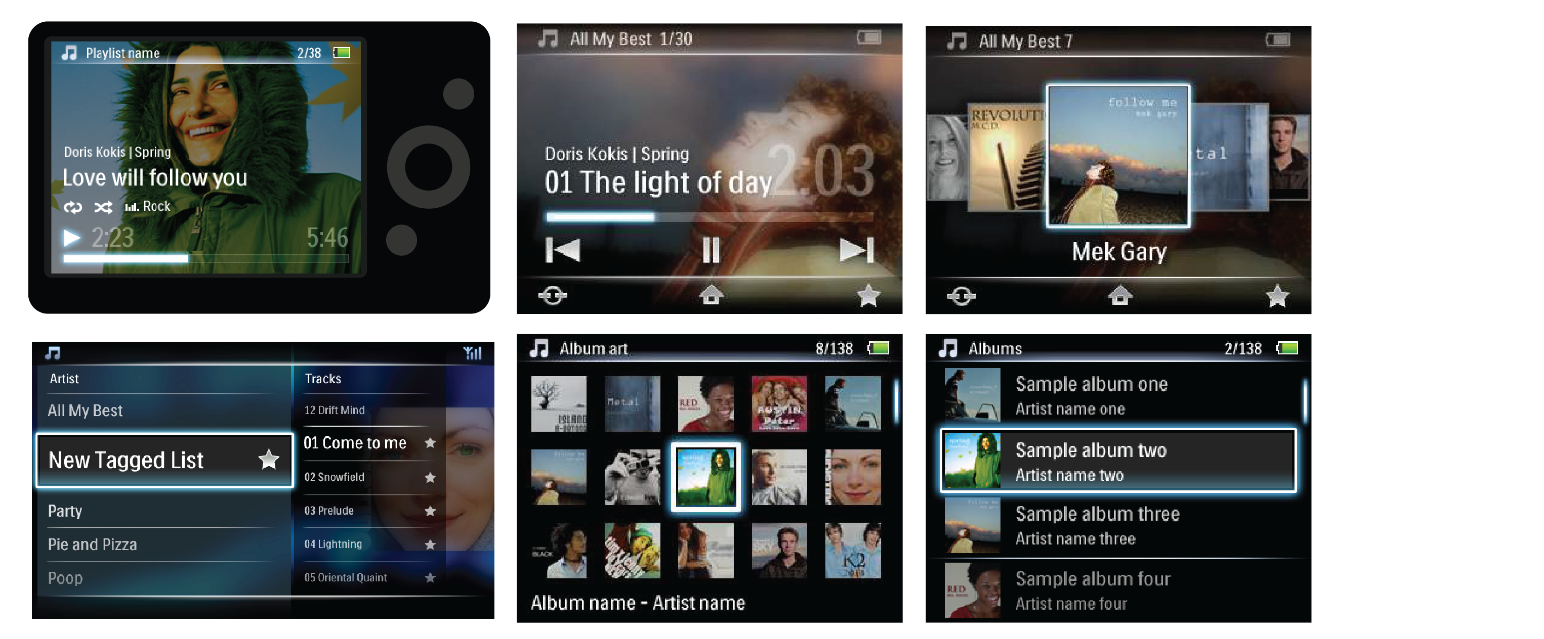
OneUX promotes heads-up user experience. Hence the navigation encourages a "Play" centric navigation where the user is never more than a click away from enjoying the content.
To achieve this, OneUX proposes a Diamond navigation system as described below. This concept places the Play State in the center and the 4 secondary activities are organized in the 4 directions. This allows for a better memorability of the navigation. It also flattens a lot of nested navigation and brings the key functionalities up-front.
Diamond Navigation applied to Media Player
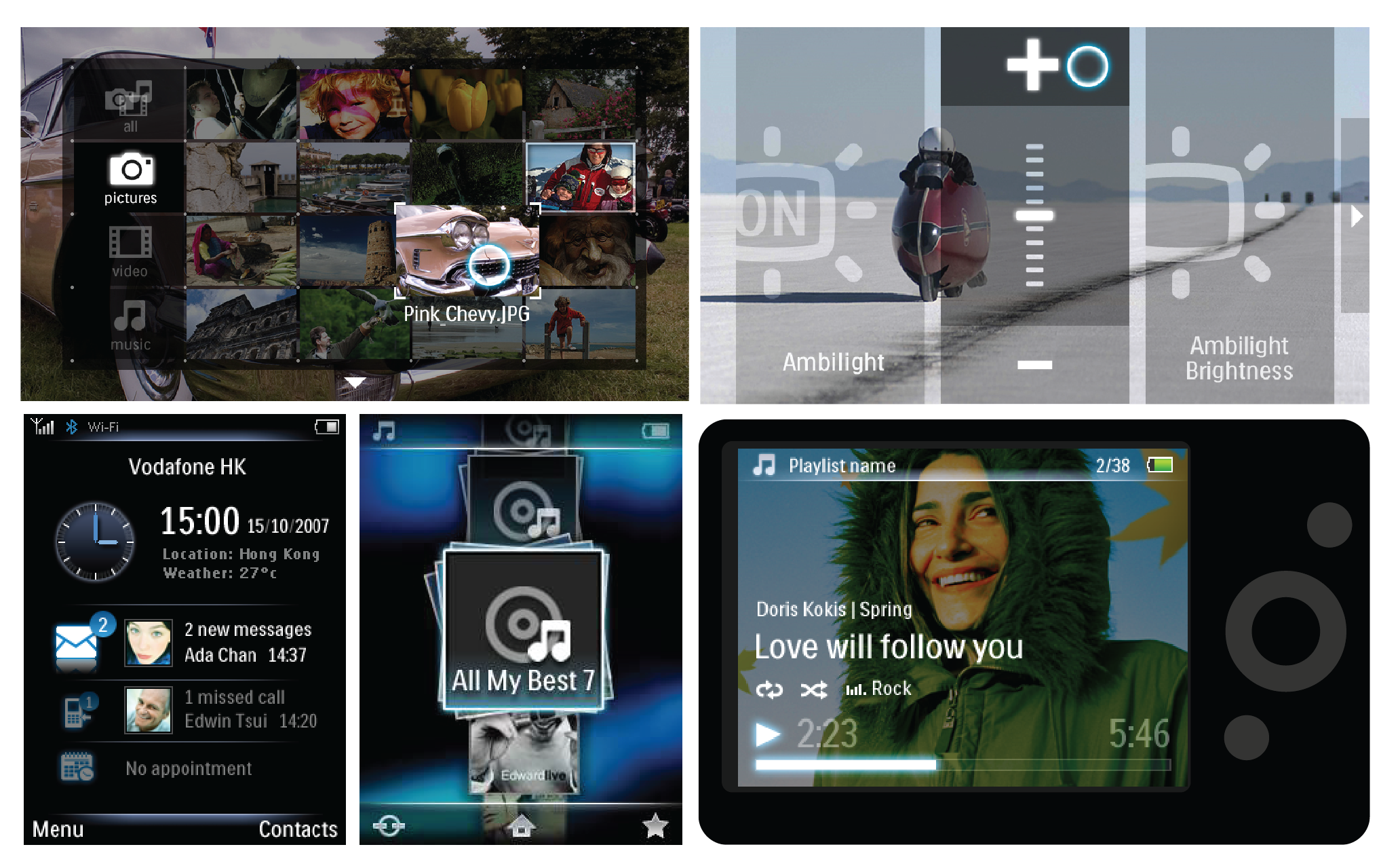
Manifestations
Following examples show how the OneUX design system was applied to different Philips Consumer Electronics product ranges.
High-End Television
Home Theatre System
GoGear - Media Player
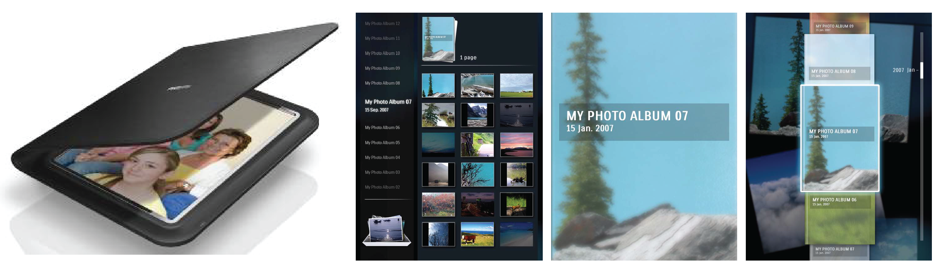
Digital Photo Frame
Xenium Mobile Phone