SAP Ganges
My Role
I lead the research, conceptualization, and execution of the SAP Ganges solution for all the key stakeholders - CPG companies, Retailers, Distributors, and Banks. The project started in early 2013 and went on until early 2014.
Research
I partnered with the product owner, engineers, and other designers to capture the user needs and turn those needs into product features that can delight the customers and also solve their pain points.
Design Strategy
I spearheaded the design strategy by actively participating in stakeholder meetings, project planning meetings, and even engineering meetings. This helped me get the pulse of all the developments happening on the project. In turn, I was able to inform and prepare the design team ahead of time for the upcoming challenges. This helped the design team avoid surprises and work smartly.
Planning
I worked closely with the project manager to define bi-weekly, monthly and quarterly goals. I helped the team prioritize the tasks based on release dates as well as engineering demands.
Getting it built
I designed wireframes, concept sketches, hi-fidelity mock-ups, and prototypes. In some cases, I also created working HTML/JS/CSS code for the engineers to explain some animations and transitions.
Leadership
I presented the concepts to the leadership and customers. I helped the team get a buy-in from the stakeholders and helped convey the design rationale and advocated the user-centered design approach.
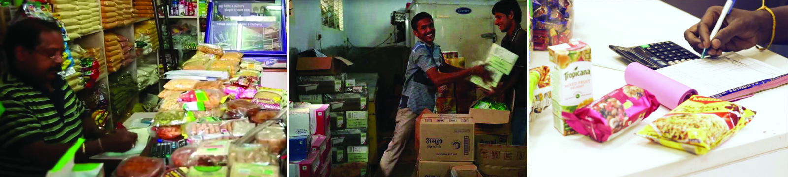
The retail sector
Kirana stores (Mom-n-Pop stores) comprise 94% of India’s retail sector. Their presence in every corner of the country helps them serve the daily needs of every Indian.
Problem
With this reach, however, has come inefficiency and miscommunication between the supply chain entities, resulting in numerous issues – most affected being the business of the Kirana store.
Last mile insights
At the same time, the FMCG companies are unable to track the last-mile-sales when it matters the most. So they came to SAP and asked if we can address this problem and help them gain insights into this very critical last mile retail problem.
The supply chain
ec0-system
To understand this problem better, the first step was to realize how big of a problem are we talking about? When we looked at the entire eco-system of the supply chain in India, we realized that we are looking at a humongous scale or problem. The 94% retail business in a country like India translates to about 33 Billion Dollars per year.
Currently, there are about 50 major CPG companies with a network of 20,000 distributors and 8.3 million retailers catering to 1.2 Billion consumers.
50
CPG Companies
20 K
Distributors
8.3 M
Retailers
1.2 B
Consumers
The CPG perspective
As a very first step to understanding the issue from our primary stakeholders (which happened to be the CPG companies that are existing SAP customers), we started talking to them and understand the problem in detail. Based on what we head from them, we were able to visualize the problem as three pieces of the puzzle.
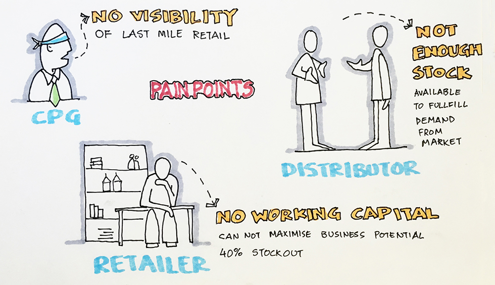
- No real-time insights on last mile retail.
- Distributors not able to fulfill demand on time.
- Retailers complain of low working capital.
The problems described by CPG were like symptoms, we wanted to find the cause.
I along with two other user researchers, two engineers and one product manager embarked on a user research journey. For any system problem that has so many stakeholders, we thought it would be best to get our own understanding of the issues faced by each stakeholder. We talked to multiple CPG executives, Distributors, and Retailers. We observed them do their business and shadowed them for days.
Based on this fieldwork, we were able to create a map of issues faced by each of the players in this ecosystem. Each one of them had a unique set of problems. Most important were the things that CPG companies wanted to get and the problems faced by the retailer at the last mile retail.
CPG
Retailer
Based on our initial findings, we explored a number of possibilities for the kind of PoS devices to be introduced. We ended up going with a tablet-based PoS device as shown in the analysis below.
Standard Cash Register
- Very limited screen real estate.
- Big and Bulky.
- Learning Curve, a lot of buttons.
Desktop Cash Register
- Bigger screen real estate.
- Cost vs. Returns not justified.
- Needs a lot of space.
- Maintenance problems.
- Not easy to store and lock.
Mobile Cash Register
- Handy
- Easy to use
- Easy to store
- Scanning and printing problems.
- Mobile has other uses too.
Tablet Cash Register
- Bigger screen size
- Cost-effective
- Scanner and printer integration
- Handy to use
- Easy to store and lock
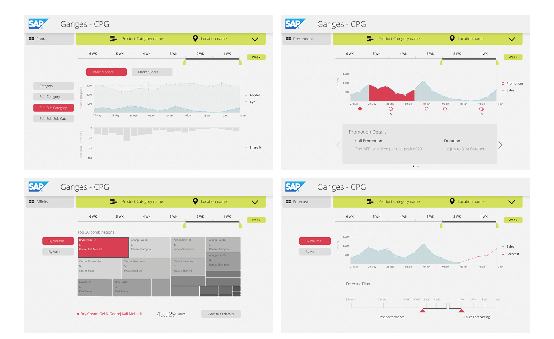
Solution Overview
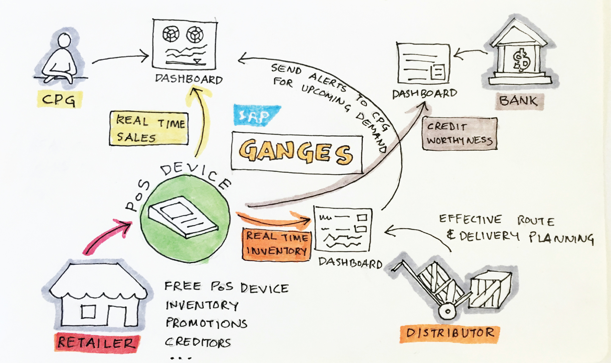
This solution had multiple parts.
- CPG Dashboard to monitor real-time data
- PoS user interface
- Bank user interface
- Distributor user interface
- SAP Control center to monitor all active devices in the field
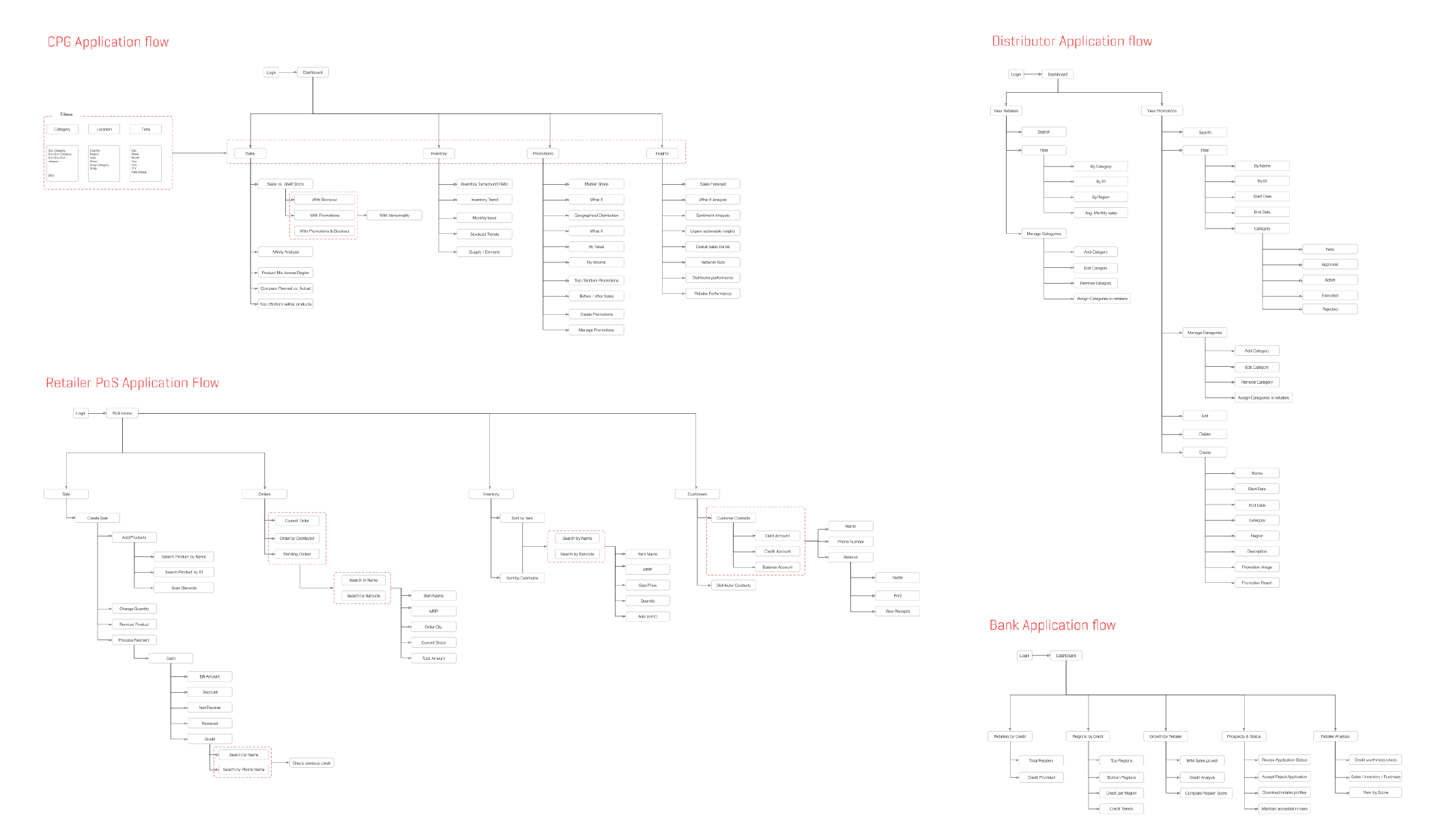
Application Flows for each part
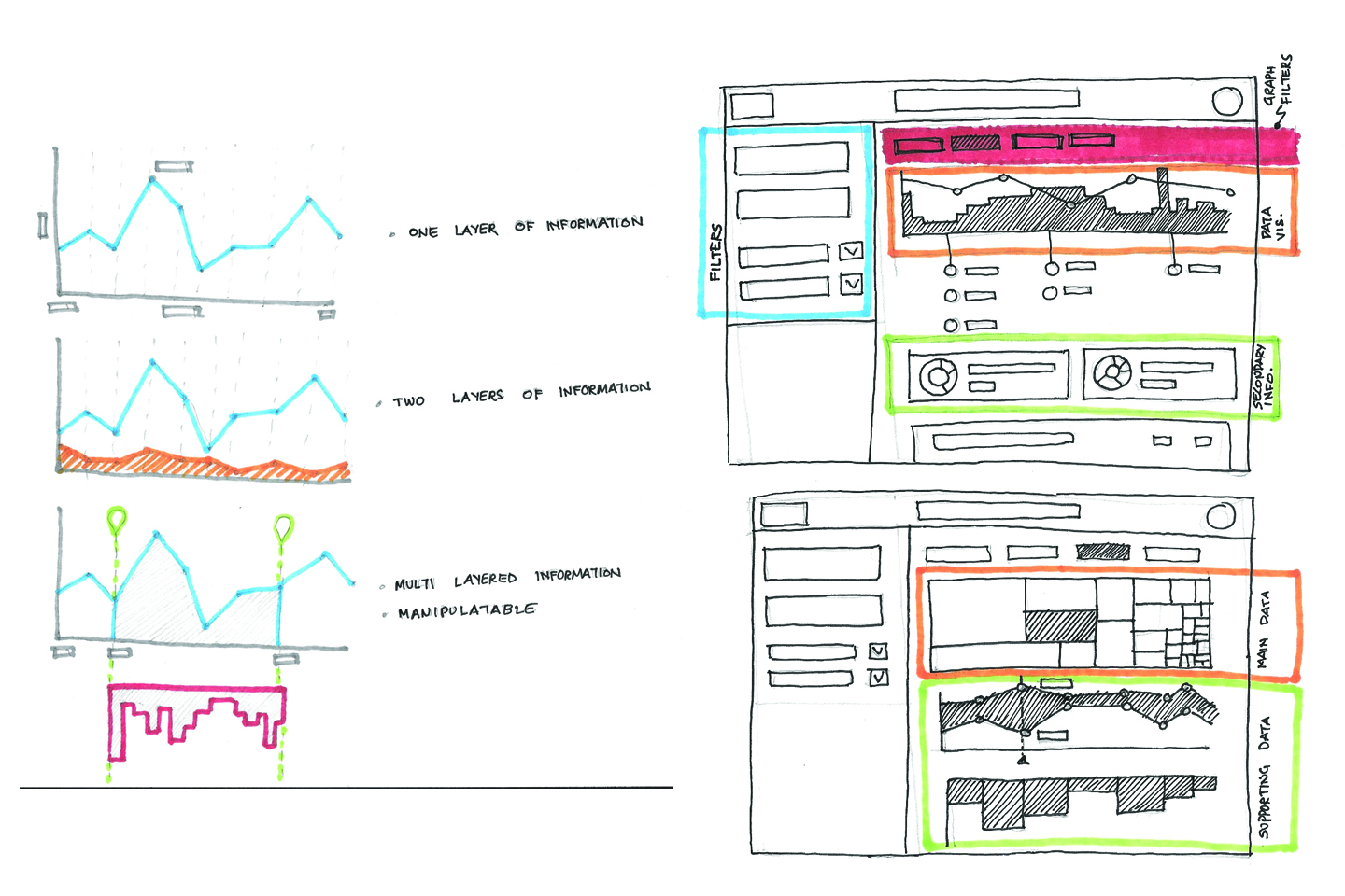
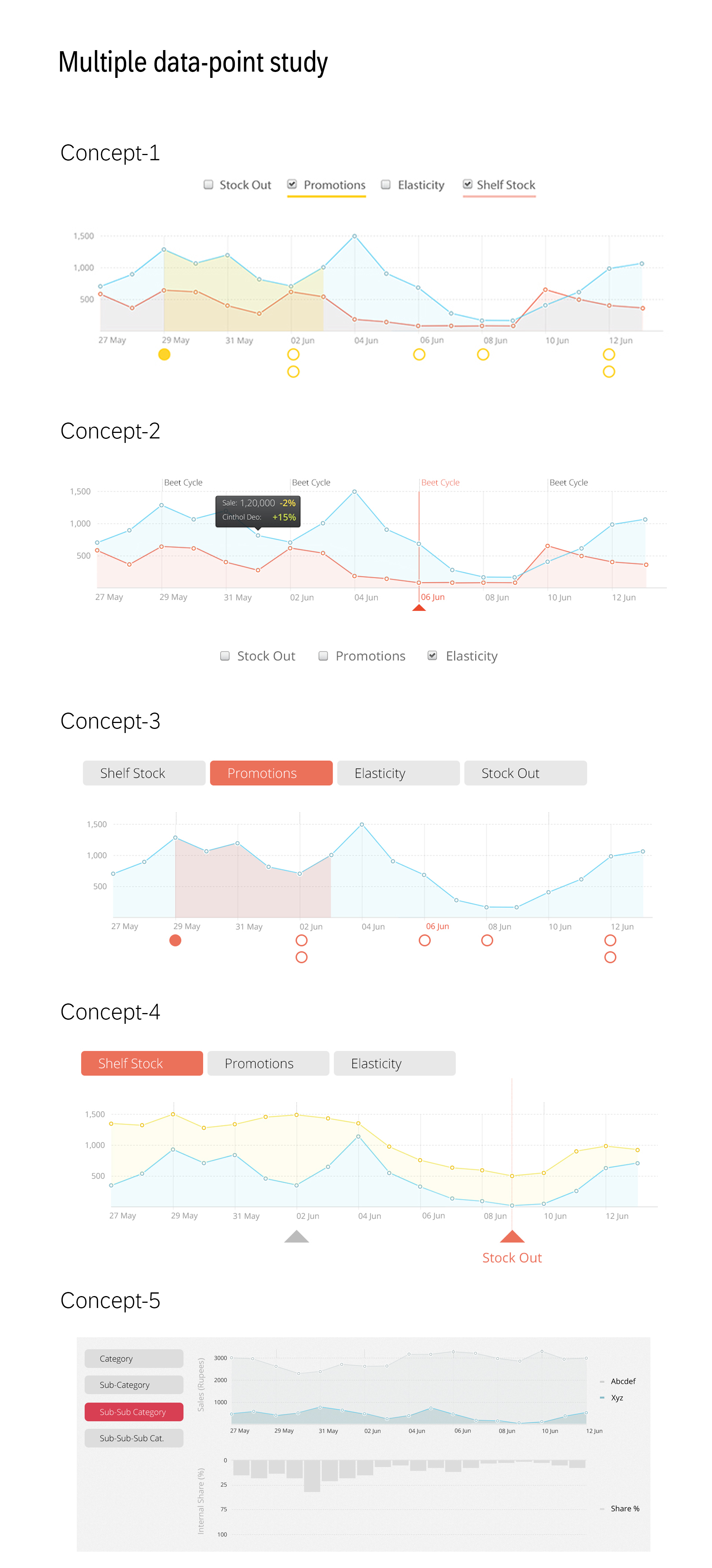
After defining the flows, we started working on design concepts. A big part of the problem we were trying to solve involved dealing with huge amount of data and dynamic information that needed to be sliced and diced by the end users. So we spent time on crafting easy to use data visualizations.
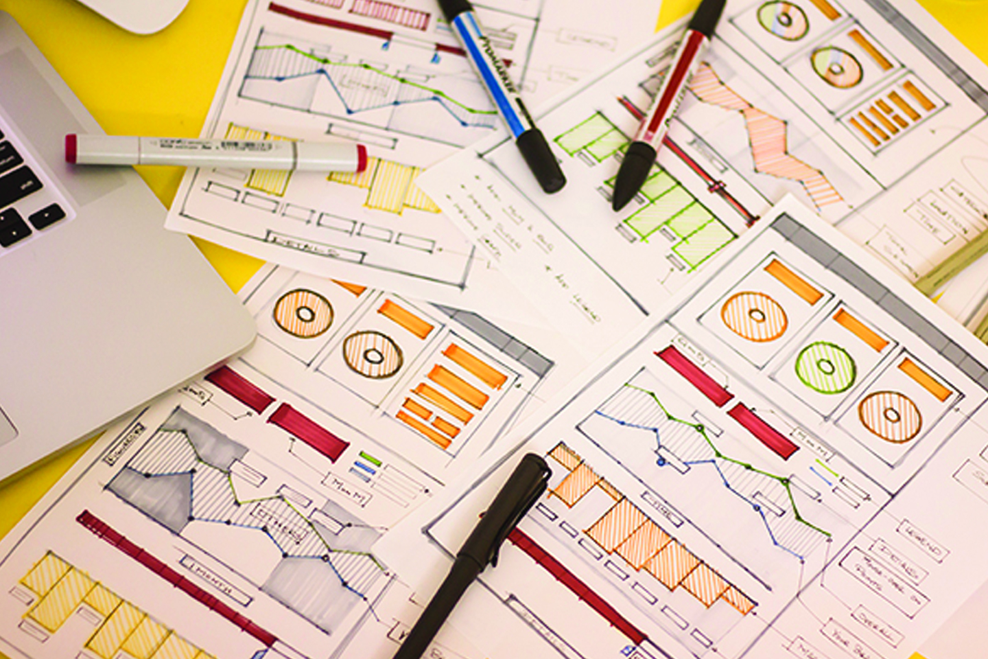
Concept Sketches
Design explorations for data visualization, navigation, and layout
Filters and Data-Sets
Another big challenge ahead of us was to figure out how we can slice and dice the huge amount of data that our users need to analyze. The toughest one was for the CPG dashboard. At any given point, the executives should be able to review real-time data across locations, time frame and huge sets of product categories.
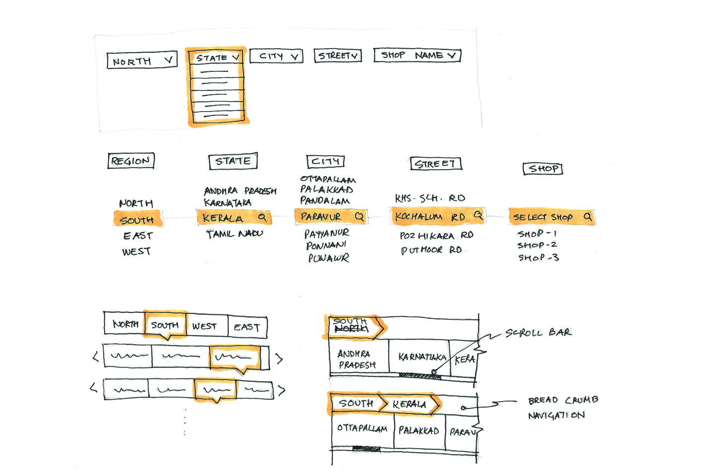
Filters
There were three basic filters that were required to analyze the data.
- Time
- Location
- Products
Time: Day / Week / Month / Year / Q-Q / Y-Y
Location: Country / Region / Area / Street / Shop
Product: Category / Sub-Categories (multi-level) / SKU
We explored multiple design solutions for the filters. Every time going back to the users and testing each design. With constant feedback and active involvement of the end users, we were able to quickly prototype and refine these early designs.
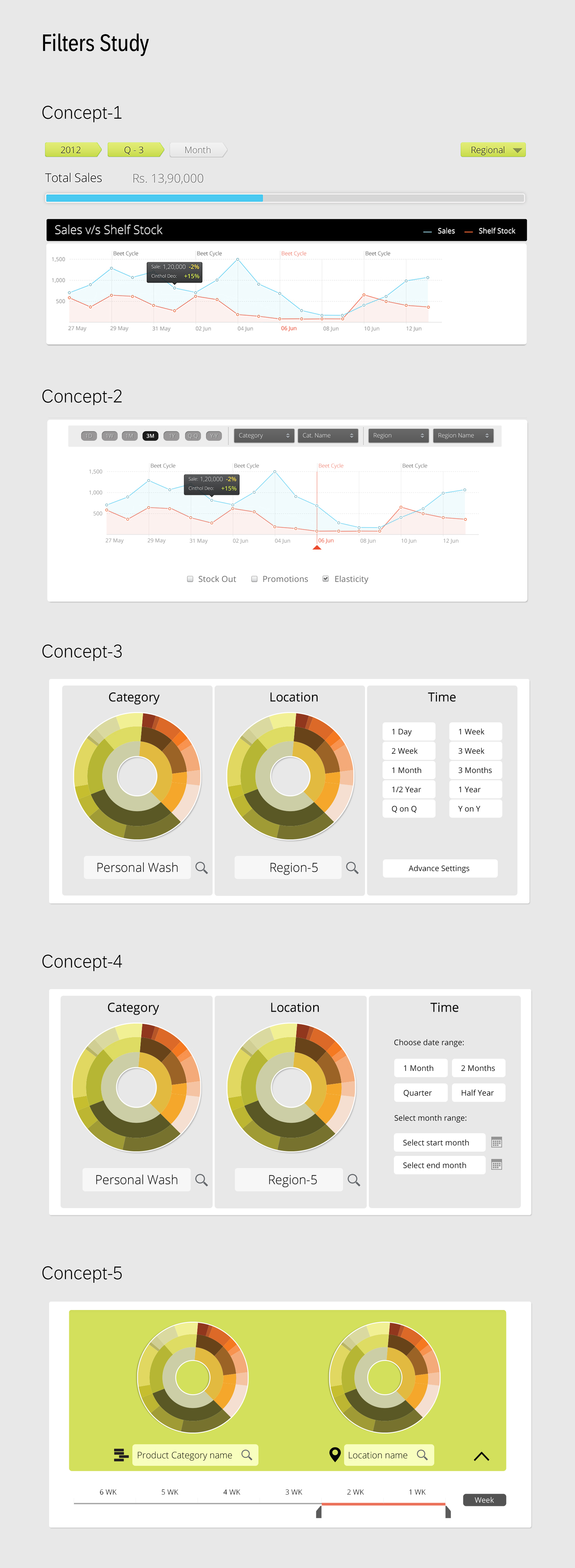
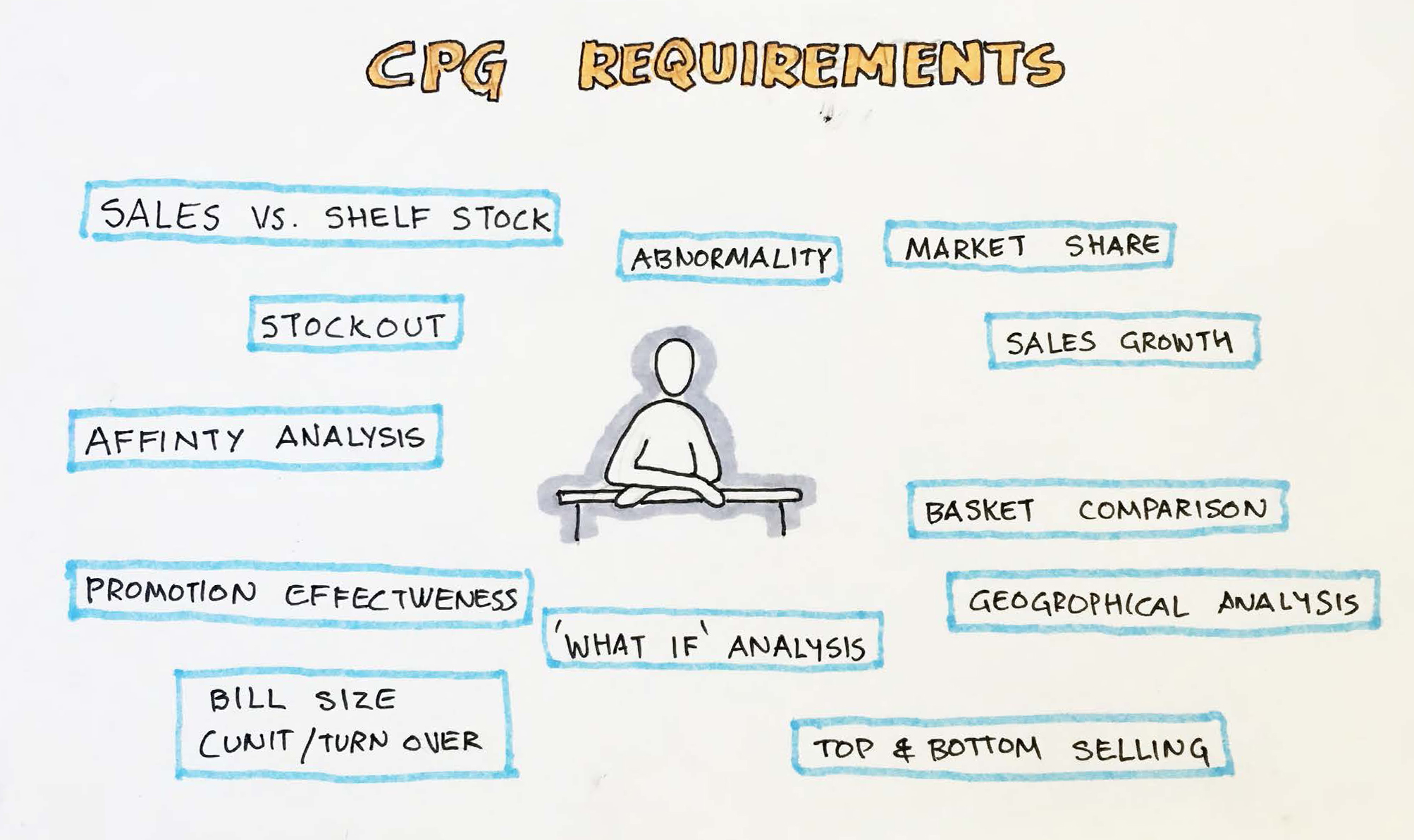
Data-Sets
When we interviewed our stake holders, we realised that they are all looking for multiple ways to view this complex mesh of data so that they can make sense out of it. To understand this, we asked them a lot of questions and documented what they were saying.
- Sales trends based on regions, category.
- Abnormality in sales and stockout.
- Change in market share over a period of time, continiously losing market share?
- Sales Trend using product filter, time filter and area filter.
- Summary of Top 'X' selling and Bottom 'X selling products using time and area filter.
- Summary of Top 'X' selling and Bottom 'X' products which have shown maximum sales growth [based on 3 months prior sales average and average during the promotion].
- Which products demand is high in the beginning of month, mid of the month, end of the month. [Time period affinity analysis].
- Ability to configure planned sales and compare planned and actual sales.
- Inventory Turnaround ratio.
- Product mix across regions.
- Effect of promotion on sales [before, during,after].
- Effect of promotion on market share [For the given promotion what was my average market share 3 months before, during the promotion and 3 months after].
- Effect of promotion on stockout [When the promotion was running for the given selection did we encounter stockout].
- What are the top promotions which yielded maximum returns?
- Based on past data predict which promotion, for a particular SKU, in a particular regions, is going to yield maximum returns.
- Ability to perform "what if" analysis on sales, inventory, and stockout e.g. If my sales increases by x% whats the effect on stockout, if my sales projection is x% how much inventory I need to stock to prevent stockouts.
- What is the reach of my products. E.g. For a given filter on time, area, and product what is percentage of stores who are selling this product?
- What is the distribution of bill sizes [which places/regions the bill amounts are more, people have a tendency to buy in bulk and which places the bill size is very small and number of items are also very small].
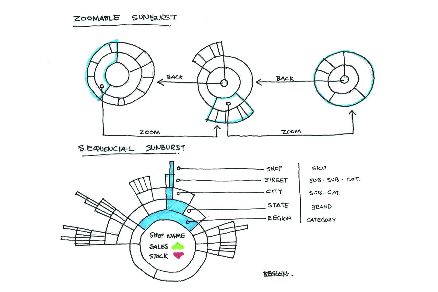
There were a number of such data points that the CPG wanted to analyze. On top of that, they also wanted to cross-analyze multiple data point overlaps as shown in the image below:
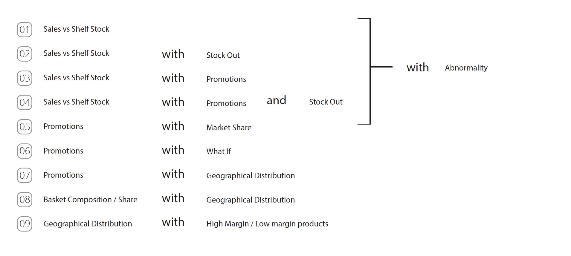
As you can see, there are multiple ways in which one can slice and dice the various data points, overlap them and make meaning out of the noise. To make this easy, we explored various possible ways in which users can do this efficiently but at the same time being careful that it does not become chaotic.
Putting it all together
Once we had done these individual studies on the key components of the interface - The Layout, Filters, Data-point visualizations etc. we started putting it all together to create a cohesive user experience.
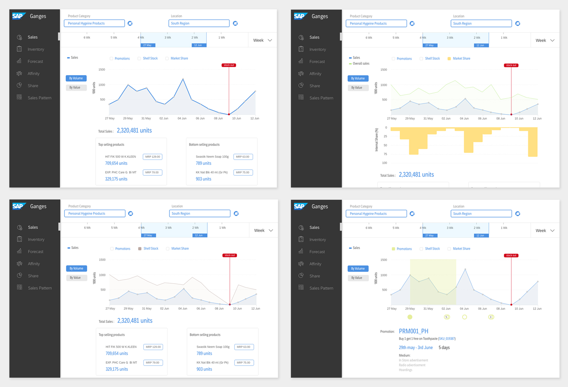
Filter drop-down animation
The filters were hidden in the top strip as we heard from our users that once they select a filter, they would do a lot of data analysis before choosing to change the filter. Hence the filters need not stay open all the time.
User Feedback
We got a mixed response to this proposed design. On one hand, the users loved the amount of data they can analyze in real-time and how they can mix and match different data-sets. But they were not able to understand the filters properly. They specifically didn't understand the drop-down filter. Every time they would need to open it, the rest of the user interface moved down. A lot of movement was also felt as a distractor.
This is a classic problem faced when we try to solve the problem with its face value rather than understanding the hidden need.
Users complained that direct manipulation of category and location fields was not possible unless you opened the filter dropdown. This also resulted in two extra clicks to get the job done.
Lastly, we also got mixed reactions on the choice of colors. Most of the users felt distracted by the use of bright colors and a very strong accent color. The key information was losing focus and the user's eyes were directed more toward the action buttons.
Re-Design
We had realized that we got few things right and few things wrong.
It was time to iterate on the designs based on the feedback. We set out to re-designed the interface to make it less distracting. We also removed the animated drop down and incorporated a much cleaner version of the filter that would allow direct manipulation of filter parameters.
At this point, the engineering team had already started working on the basic implementation of these designs. But since we had not reviewed these designs with the users, I had informed the engineering team that there might be design changes once we have the feedback. To mitigate the re-work for the engineers, I suggested that the start developing the code for individual data visualization components, basic UI elements etc. I told them to avoid working on the layout and interactive widgets list timeline, filters etc.
This proved to be a very wise decision. Because once we had the feedback, the layout changed, the interactive elements changed, but the simple controls like buttons, tables, lists, graph components relatively had less impact. This made incorporation of the user feedback very smooth into the development life-cycle.
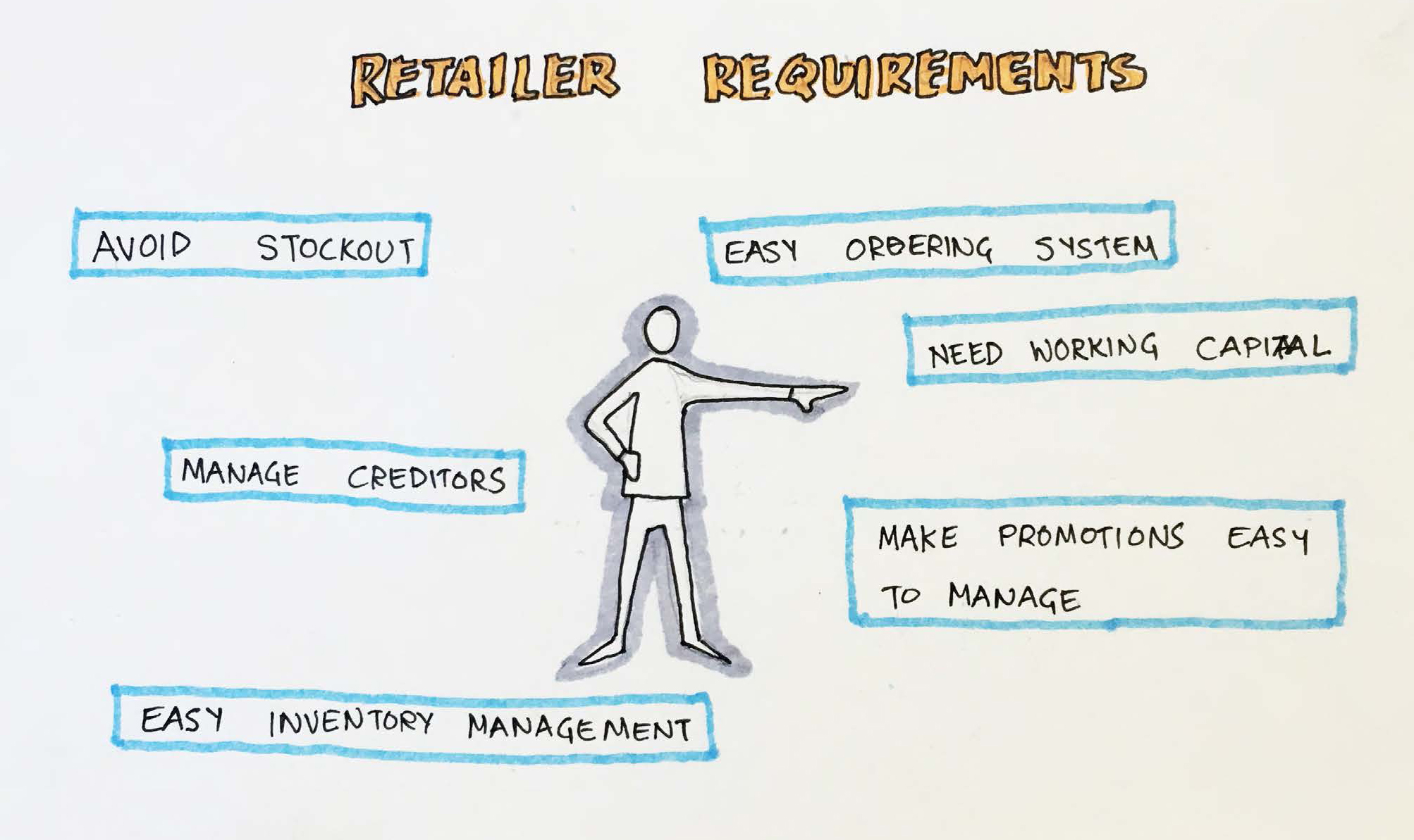
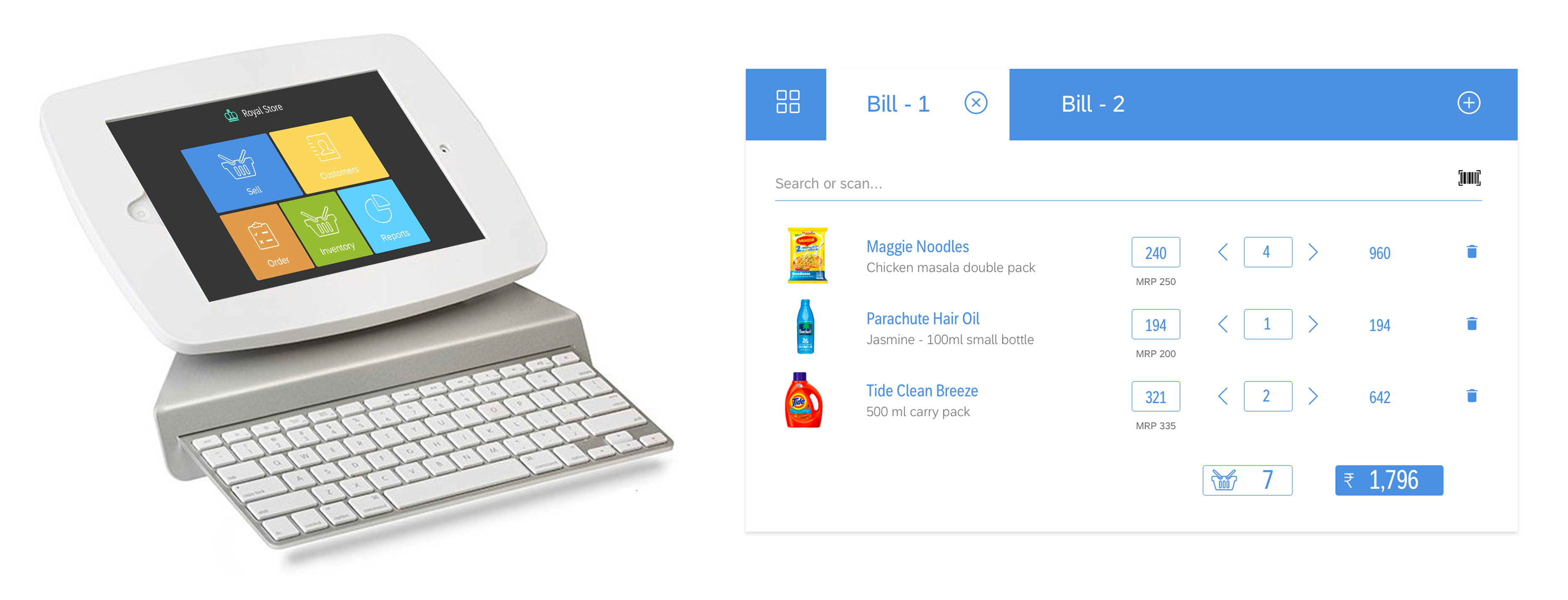
Point of Sale Device
The point of sale device was a touch screen android tablet housed inside an enclosure. The data input could also be done using a keyboard attached to the cash register. The PoS had a barcode scanner, credit card swipe, and a Receipt printer attached.
The PoS allowed the shop owners to manage inventory, record sales, manage creditors, auto generate orders, and allowed them to remember promotions. Whenever they would scan a product which has an ongoing promotion, the PoS will remind them.
The user interface for the PoS followed a minimalist design approach to reduce distraction and also reduce errors. It also relied on product imagery to reduce cognitive load.
Lessons Learned
Problems on their face value can be deceiving.
We realised this a little late in the project. After our initial user research, we should have involved a users a bit more in the design process to understand their preferences. This would have saved us time we spent fixing some of the issues that could have been avoided.
When we are dealing with a lot of data, we tend to think of highly interactive widgets to help users navigate the data and make sense out of it. But sometimes we stretch these interactions too far and instead of making the data consumption easy, the widget themselves become complex creatures. Finding the right balance between the interactivity and simplicity was the most challenging part of this project.